A case study in full service design, from branding, packaging, product, manufacturing and website creative direction.
The Why
TAMPOUT was conceived by an OBGYN Nurse Practitioner and Midwife as a safe, at-home / on-the-go solution for retrieving retained menstrual products such as tampons, menstrual cups, or discs. There are often overlooked risks, including Toxic Shock Syndrome, when these products are forgotten or stuck within the vaginal cavity, and removal traditionally requires immediate medical assistance that can cost thousands of dollars.
The Solution
TAMPOUT is a cost-effective solution for women that is intended to help reduce the number of emergency room visits due to health concerns arising from inserted menstrual products. While in the feminine hygiene product category, this product stands apart from anything else on the market by being the first of its kind to address this problem.
From Invention to Consumer Product
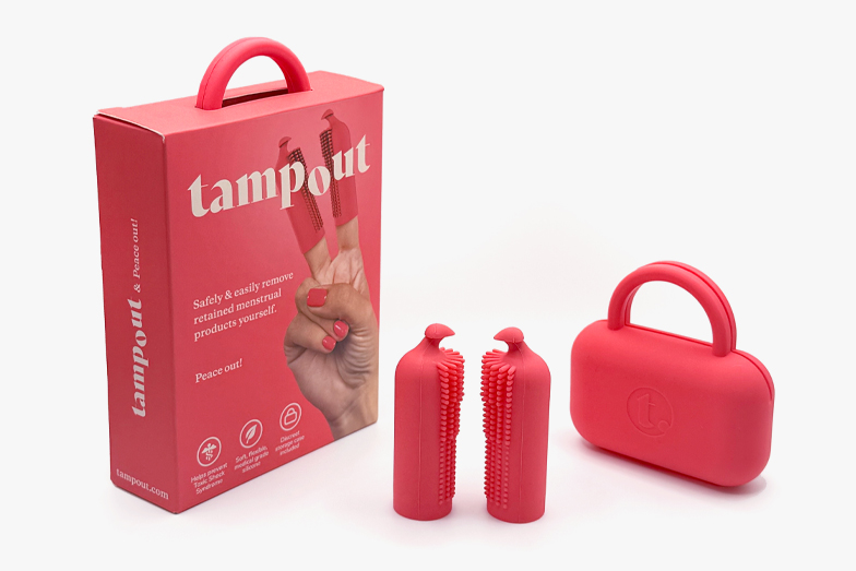
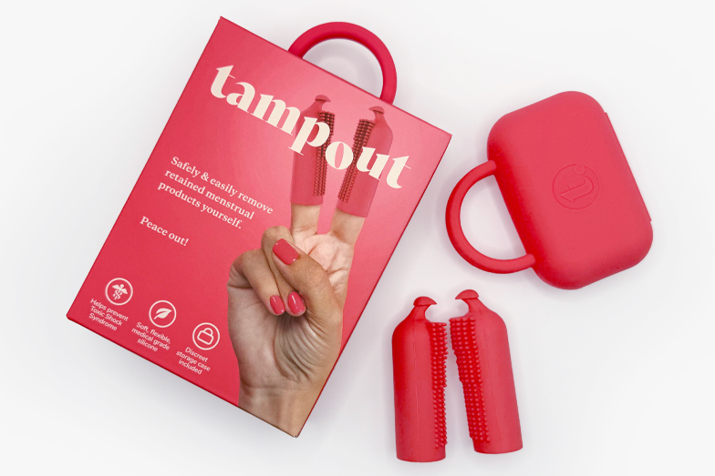
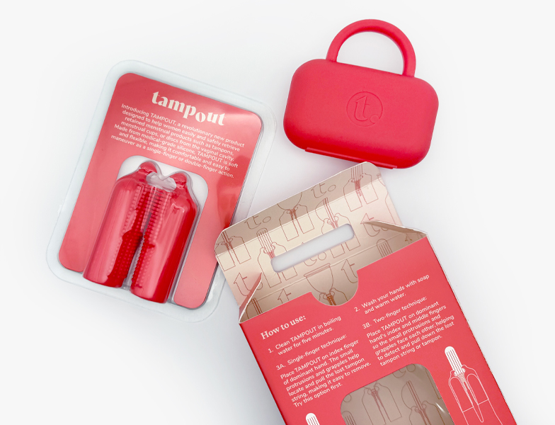
Dr. Yuliya Boruch was committed to addressing this acutely overlooked aspect of women’s health and partnered with Olivialand Studio to turn her invention into a fully developed consumer product and brand. TAMPOUT is an emergency product that requires educating customers, so the biggest design challenge was going to be how to communicate what the product is, what it does and why you need it. The name, visual language, imagery and product form and presentation all had to work together seamlessly for the message to be clear and impactful.
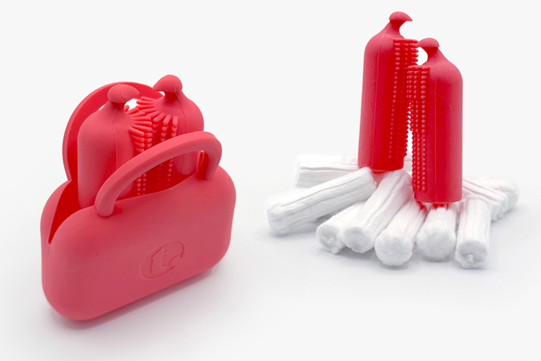
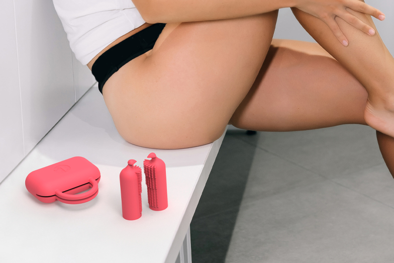
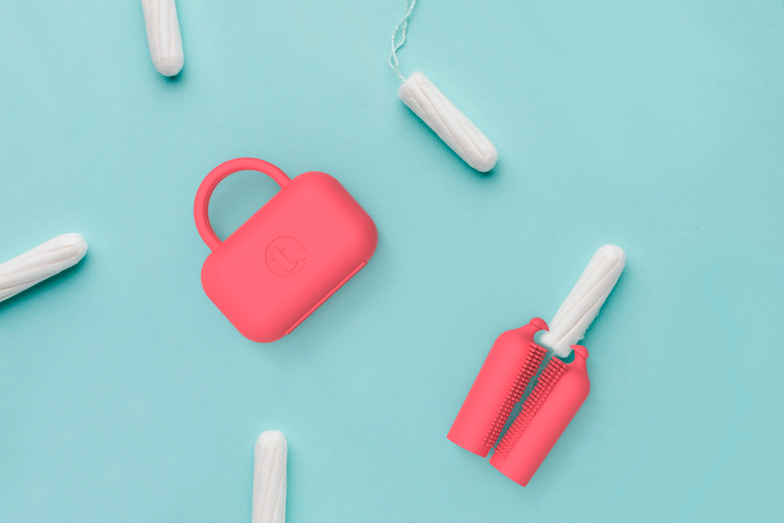
On the product end, we worked to refine and optimize the invention by iterating on the form of the gripples to improve function. When considering the complete use cycle, a stylish storage case was additionally designed to house the product on-the-go. The case can double as a sanitizing bag for product cleaning while also offering an eye-catching hanging loop to complete the packaging!
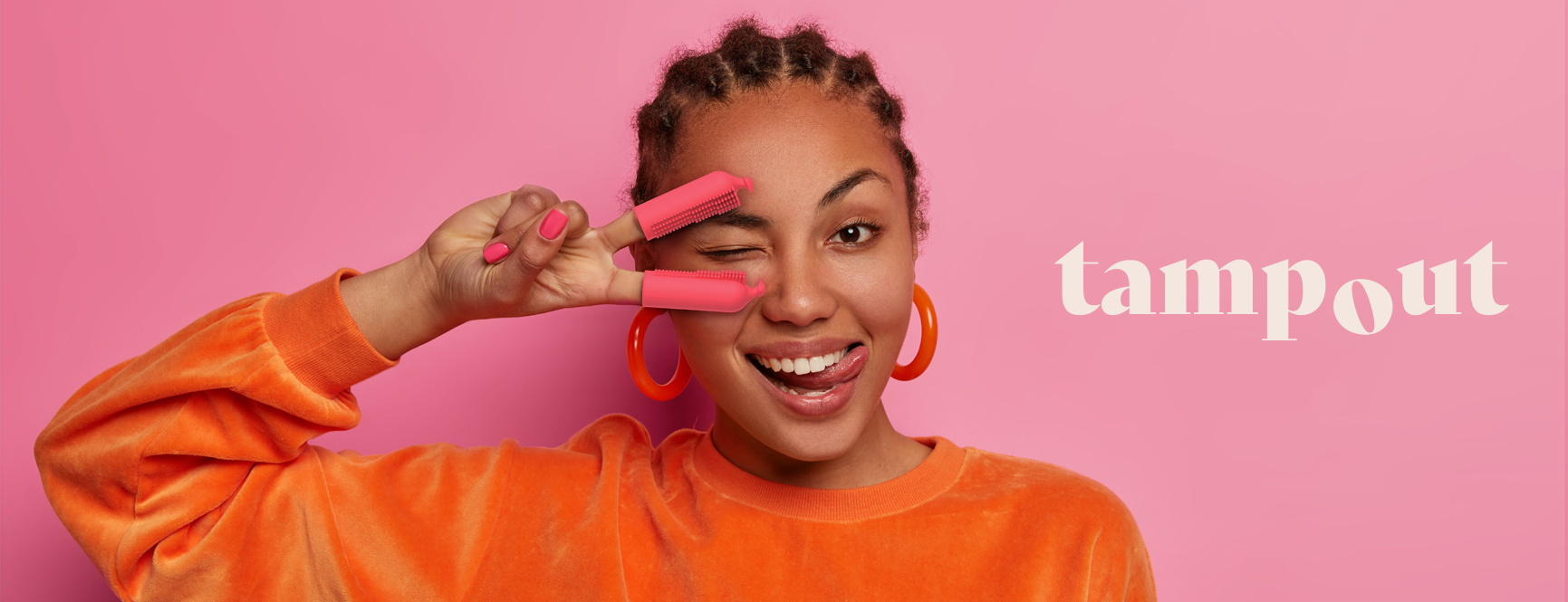
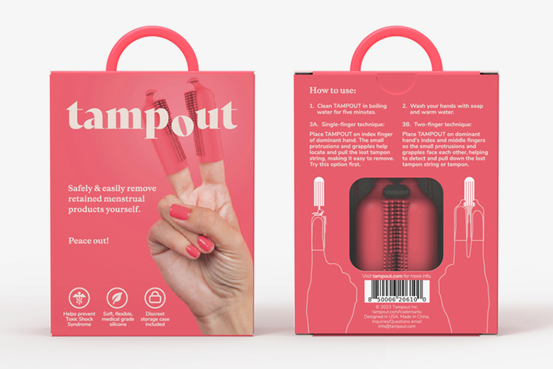
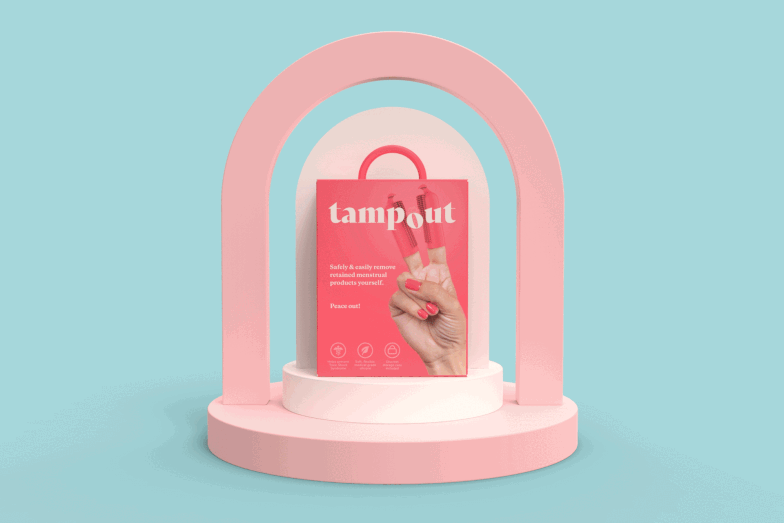
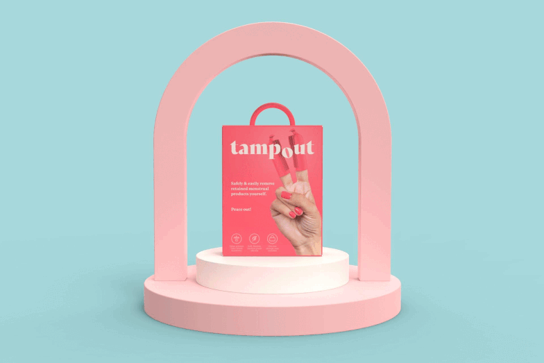
The “Peace Out” Concept
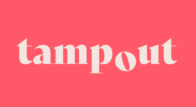
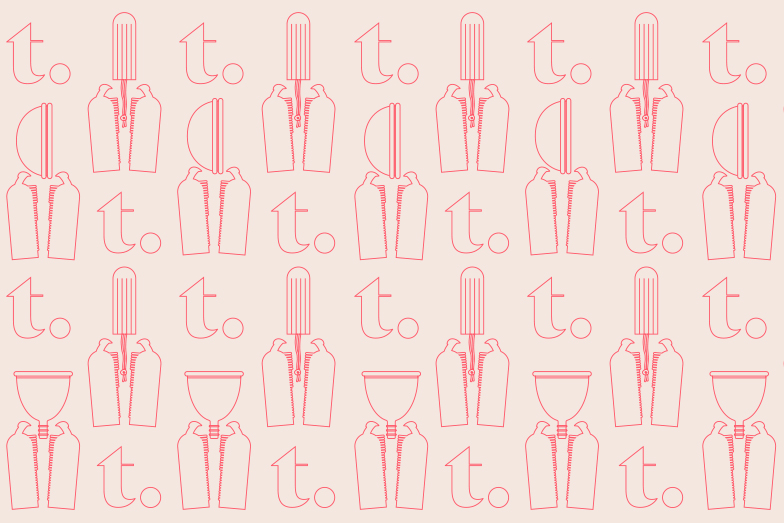
The brand’s visual strategy centers around the two-finger peace sign that shows the product as it’s intended to be used, while presenting a recognizable image to communicate peace of mind. The logo, with its subtle animation on the “o”, was designed to work well in composition with the peace sign image on the packaging, as well as in isolation for other applications.
The design goal was to present this innovative product in a way that is simple, approachable and to the point, but also vibrant, eye-catching and youthful. The logo, graphic elements, imagery, color selection, product and packaging details all work together in harmony to create a strong online and on-shelf presence.