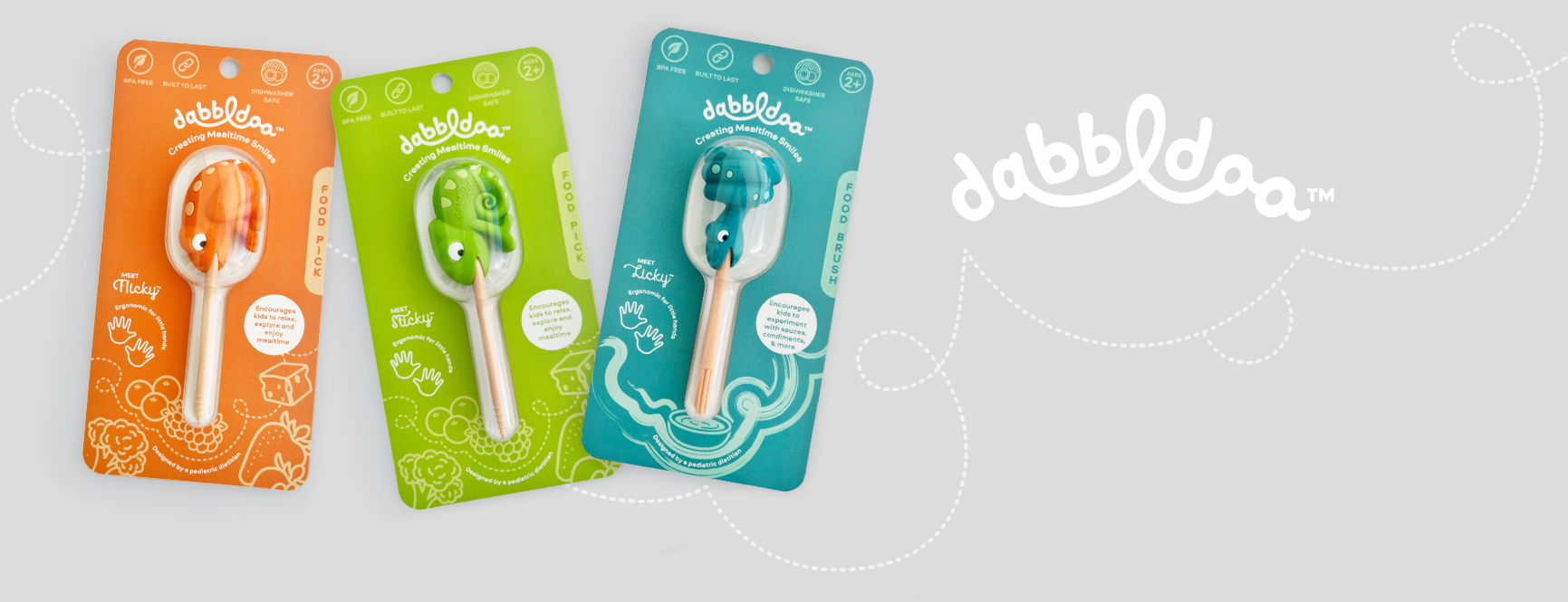
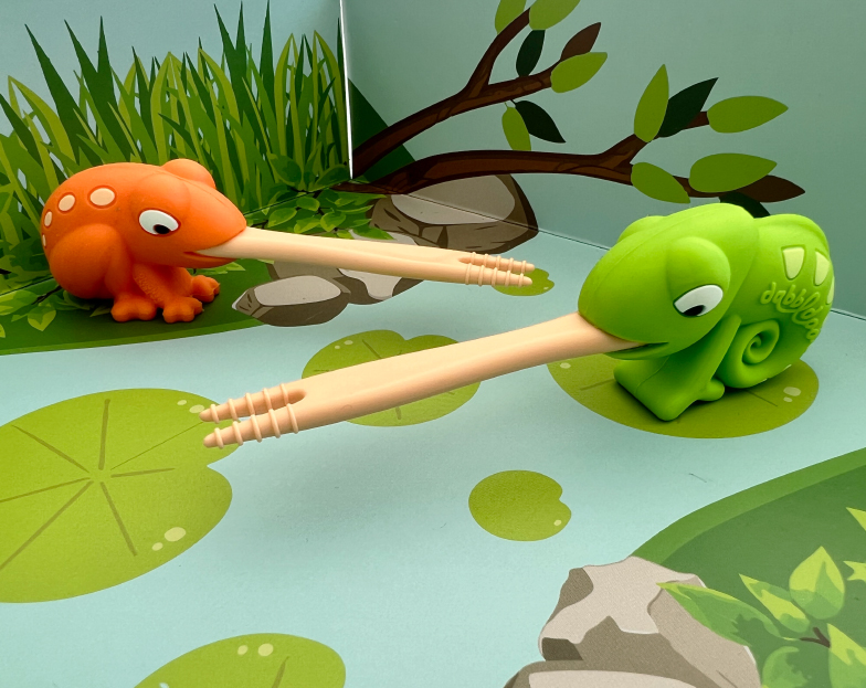
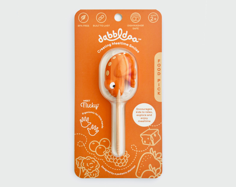
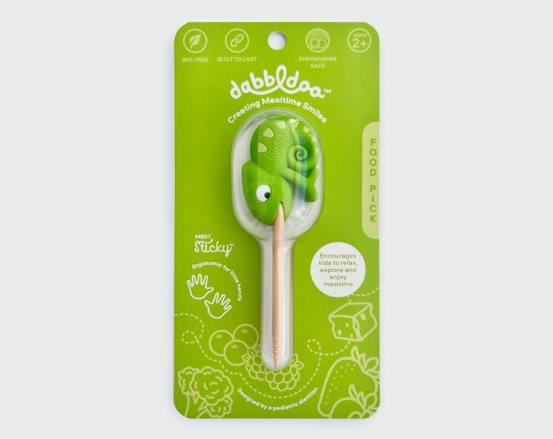
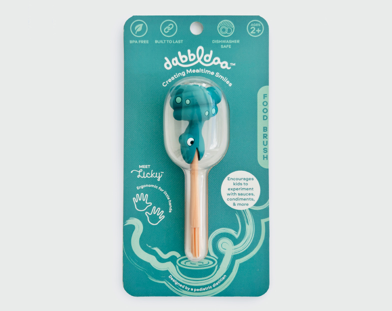
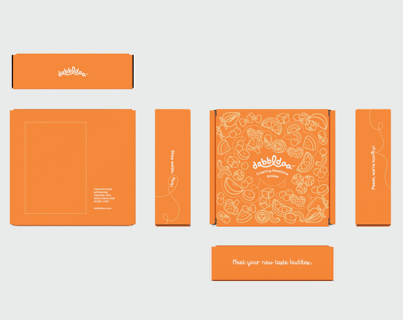
Dabble Dabbldoo! The brand design for these innovative new feeding tools is just as thoughtful as the products themselves, creating a well defined world for the characters to live, and an integrated experience for kids. The brand look and feel embodies a playful and adventurous spirit, utilising winding, curved script, squiggle lines and illustrations to depict exploration, imagination and creativity.
A Playful Logo
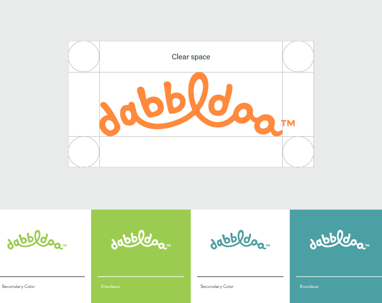
The arched form represents optimism and animates the word by lifting it upwards. Soft, creamy handwritten script is personal, playful and alludes to flavor. The unexpected connection of letters conveys a sense of exploration and togetherness.
An Inviting Palette
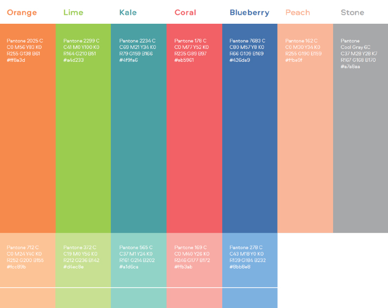
Dabbldoo colors were selected to express warmth and flavor, with a comfortable overall energy. They are bright and cheerful but not overly saturated or intense, maintaining a friendly softness.
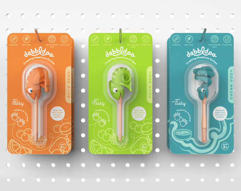
A Whimsical Pathway to Packaging
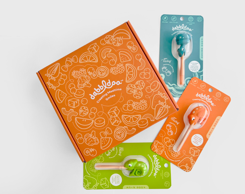
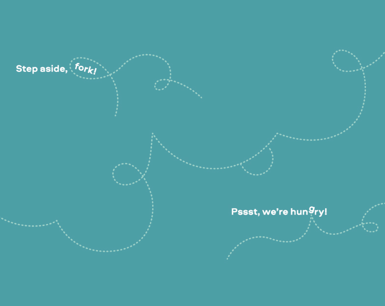
Dashed squiggly lines support food illustrations by adding movement and energy. They surround, poke and pull elements, including typography, in the graphic layouts. The packaging artwork is animated without overshadowing the product, allowing it to take center stage while amplifying on shelf impact with a strong color statement.
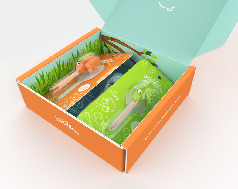
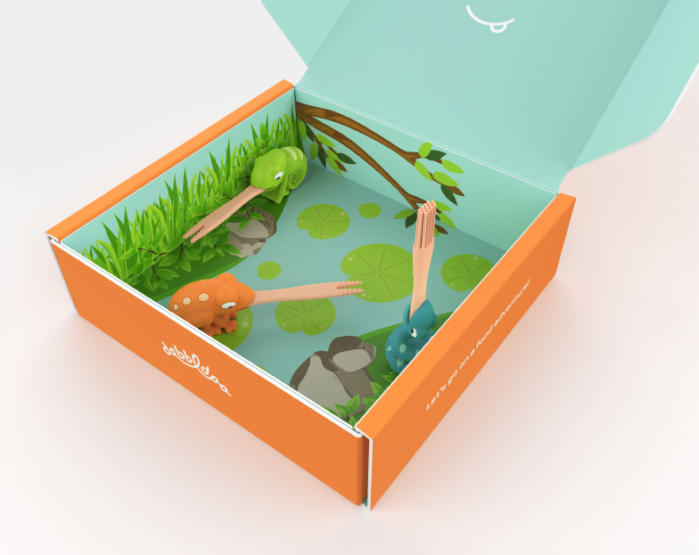
An Interactive Mailer
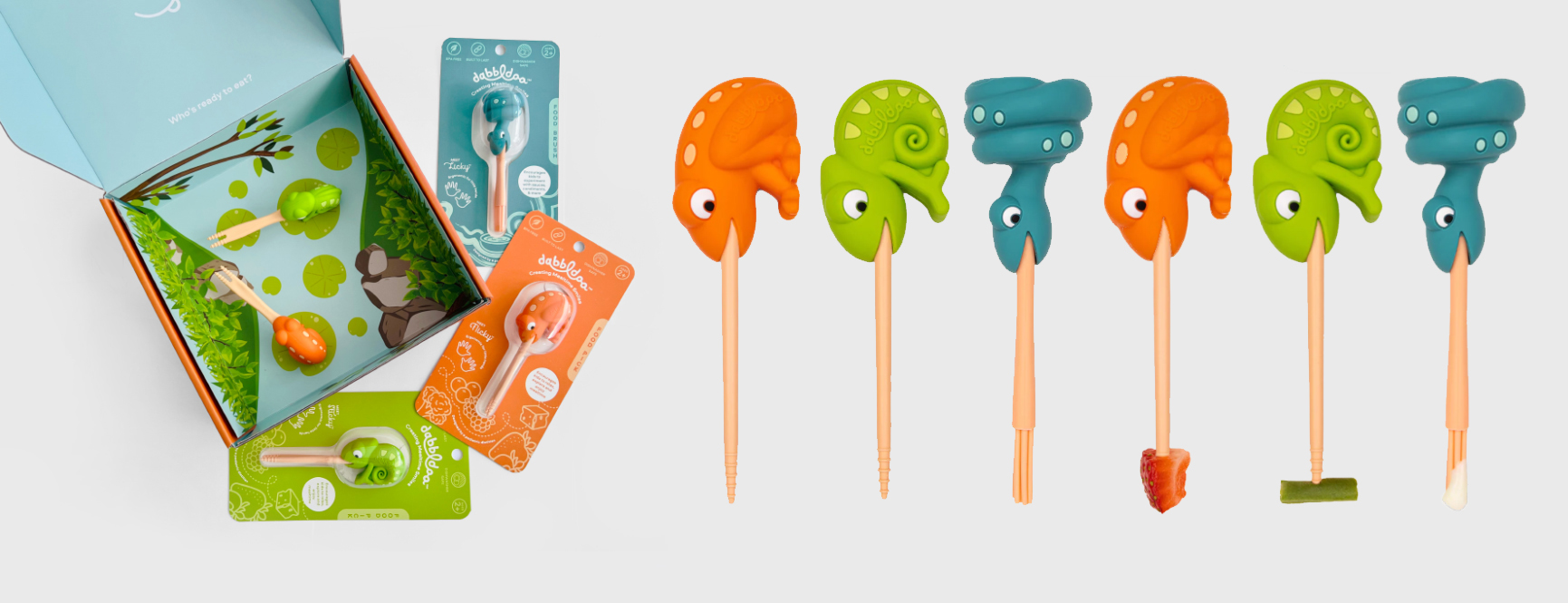
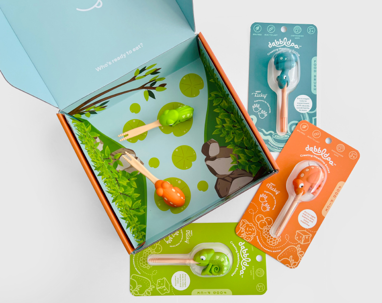
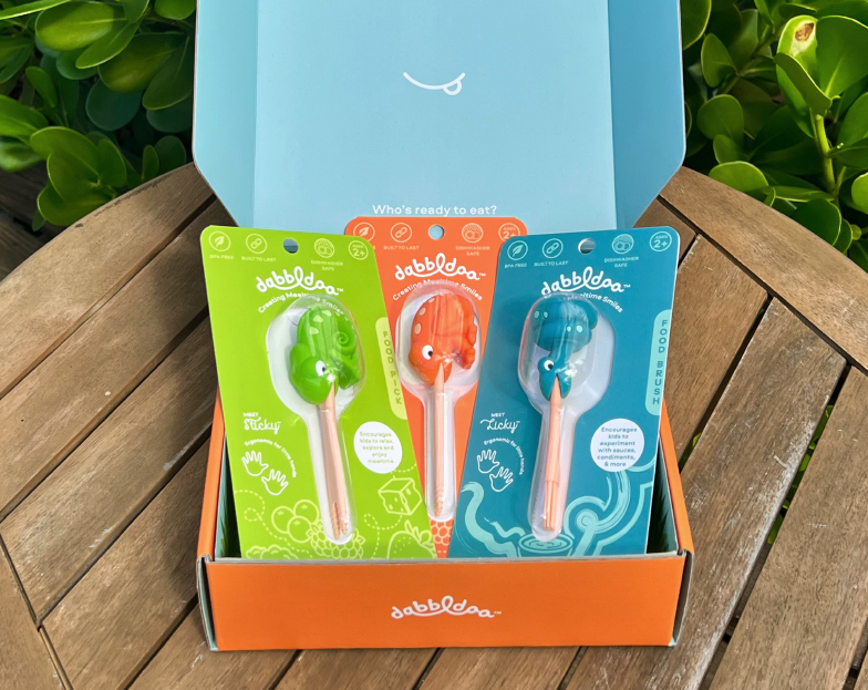
The mailer box houses a fun surprise – a graphic natural habitat insert for your new mealtime buddies! This extends the usefulness of the box while also creating an environment for the characters to further spark the imagination.
Character Names
Part of the branding exercise was to give a personality to each character through naming. And so Flicky, Sticky and Licky were born!
Product Development
Click here to learn more about the creation of the Dabbldoo products.


